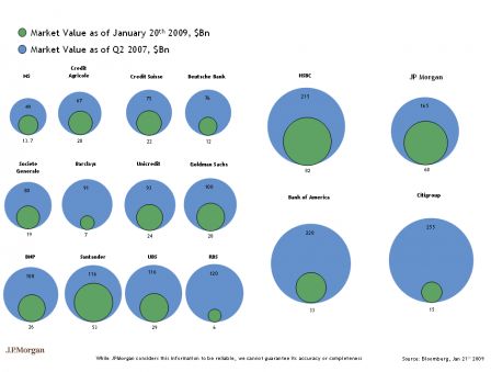
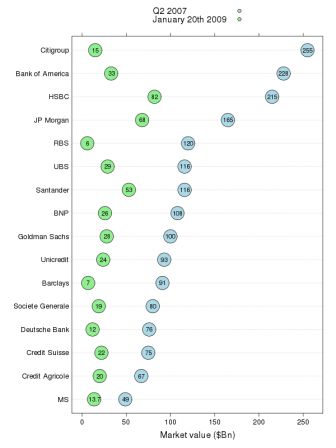
Here is a proposed alternative to this bubble inferno pointed out in the
revolutions blog


and the R
code behind it (here is the
data). This is now item
150 in the graph gallery
   1
   2 ### read the data
   3 d <- read.csv( "data.txt" )
   4 d$bank <- ordered( d$bank, levels = d$bank )
   5
   6 ### load lattice and grid
   7 require( lattice )
   8
   9 ### setup the key
  10 k <- simpleKey( c( "Q2 2007",  "January 20th 2009" ) )
  11 k$points$fill <- c("lightblue", "lightgreen")
  12 k$points$pch <- 21
  13 k$points$col <- "black"
  14 k$points$cex <- 1
  15
  16 ### create the plot
  17 dotplot( bank ~ MV2007 + MV2009 , data = d, horiz = T,
  18     par.settings = list(
  19         superpose.symbol = list(
  20             pch = 21,
  21             fill = c( "lightblue", "lightgreen"),
  22             cex = 4,
  23             col = "black"
  24         )
  25      ) , xlab = "Market value ($Bn)", key = k,
  26      panel = function(x, y, ...){
  27        panel.dotplot( x, y, ... )
  28        grid.text(
  29             unit( x, "native") , unit( y, "native") ,
  30             label = x, gp = gpar( cex = .7 ) )
  31      } )

 and the R code behind it (here is the data). This is now item 150 in the graph gallery

